Field notes / Across industries · 4 min read
Three branding patterns worth testing in 2026
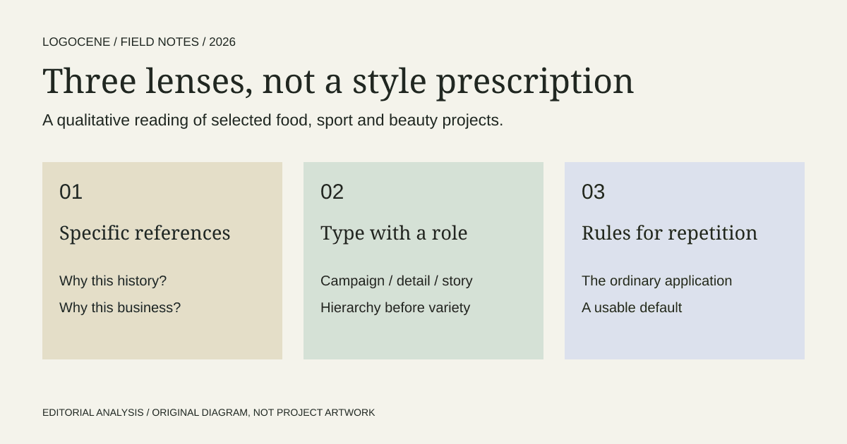
Recent projects offer useful hypotheses rather than a universal style forecast. Our selected 2026 examples point to three questions: does the historical reference belong to the product, can typography carry more of the identity, and does the system work beyond its hero image?
On this page
How to read this selection
This is an editorial reading of three published projects available by 18 October 2026, across food, cycling apparel and beauty. We selected them because their documented decisions suggest useful commissioning questions. We did not draw a representative sample of new identities, measure adoption or interview customers. “Pattern” here means a connection in this selection, rather than a claim about the whole market.
The examples also have different dates. A newly shared article can cover an older project. We use the project or coverage date that the source supplies and avoid treating a feed's recency as proof of a launch date.
1. Specific heritage is more useful than a vintage mood
Galopain's January portfolio connects ancient-flour bread with medieval references. In sport, the June Rapha coverage describes a typographic system informed by cycling ephemera. Both references belong to the subject being communicated.
Our inference is that the connection matters more than the period style. A reference can provide a reason for the visual choices: why the lettering has this character, why a motif repeats, why a material feels appropriate. A moodboard made only from fashionable images cannot provide the same explanation.
For your brief, write the sentence “This reference belongs here because…” and finish it with a fact about the business. If the answer is only that the style feels premium, keep researching. A local archive, a manufacturing process or a specialist community may reveal something more specific.
2. Typography can be the project
Rapha's reported system retains the script mark while expanding the surrounding typographic language. That makes the case useful for an established business asking whether it needs a new logo. The weakest application may be a product page, a catalogue or an email template, rather than the mark itself.
Audit the work before selecting a solution. Put a campaign headline, a product specification and a long explanation side by side. If they look unrelated, define their shared rules. If they all look identical despite different jobs, define their roles.
A small business can test the idea without commissioning custom fonts. Use a limited family with deliberate weights, sizes and spacing. Produce three real materials and ask a collaborator to make a fourth. Their questions reveal which rules are missing.
3. The supporting world needs an operating logic
It's Nice That's July Bare Earth feature describes Blanca Doba refining decorative lettering and balancing it with cleaner typography for a beauty identity. The case is useful because refinement and application are part of the reported story, rather than treating the first expressive drawing as the finished system.
Our interpretation is a practical one: a distinctive ingredient needs an ordinary way to be used. Ask where expression should be concentrated and where information should take priority. A skincare label, for example, has content responsibilities that a generous campaign image can hide.
Do not assume a richer brand world requires more assets. It may need fewer elements used more consistently. Name the default layout, the compact layout and the exceptional treatment. Give the next person a way to choose among them.
Turn the observations into a test plan
| Hypothesis | Small test | Reason to revise |
|---|---|---|
| A historical reference clarifies the offer | Show the direction with the product description | The reference implies a different origin or service |
| Typography can carry the refresh | Rebuild three current materials before changing the logo | Hierarchy remains unclear or the name is still unreadable |
| A limited system supports everyday work | Give a template and real content to a collaborator | They must invent new styles to finish the task |
Set a review date after the first real use. Collect examples of confusion, production difficulty and inconsistent application. Those observations are more useful than counting how many people liked a launch image.
What to leave out of a trend brief
Avoid claims that a colour produces trust, that one aesthetic guarantees attention or that every brand should adopt the same style. The sources reviewed do not establish those effects. They document specific decisions in particular businesses.
Use the selection to improve the questions you ask a designer, not to preselect an answer. The strongest direction for a new business may be visually unrelated to all three examples, provided its relationship to the audience, offer and production conditions is clearer.
Describe your business
Explore concepts from your brief, with colours, fonts and a web guide to help you use the logo you choose.
First watermarked preview free. Sign-in required; no card. Download credits: $9.99 for 10, about $1 per generation.