Case study / Food & hospitality · 5 min read
Galopain: a bakery identity with a point of view
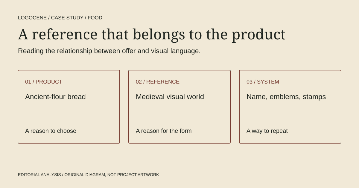
Galopain gives its bread a cultural setting before describing a product range. Charline GROEN's identity connects the bakery's ancient-flour proposition with a medieval visual language; the useful lesson for a founder is how closely the reference belongs to the offer.
On this page
Start with the product's difference
In GROEN's project description, Galopain is a warm-bread tavern built around rustic loaves and slowly worked, unrefined ancient flours. Her references include illuminated initials, manuscripts, flags and seals. The portfolio project was published on 28 January 2026; Abduzeedo's feature appeared on 17 October. Recent coverage should not be confused with a new launch.
That difference matters to the interpretation. Medieval references are doing more than supplying an unusual style. In our reading, they give an old-grain, slow-process offer a coherent imaginative setting. If the same treatment were attached to an unrelated convenience product, the argument would need to be rebuilt.
Read the identity as a family of behaviours
Abduzeedo's documented applications include an italic wordmark, an illuminated G, flag emblems and stamped graphics across bags, wrapping and printed pieces. Open the linked project to see the original work and credits. The editorial thumbnail credits GROEN; the published images do not establish physical production.
The strategic value of multiple related devices is flexibility. A small label does not need to carry every expressive feature of a large poster. A simple emblem can identify an item while a larger composition supplies atmosphere. A founder commissioning an identity should ask which element leads in each situation, rather than request the entire logo at every size.
The risk is equally practical. A rich set of symbols can become a box of decorations if no one knows how to choose among them. The more expressive the family, the more useful a few restrained layout rules become: where the name sits, which combinations are approved and which pieces can appear alone.
The wordmark and emblems have different kinds of energy
The Abduzeedo account describes a forward-leaning italic wordmark with extended letter details, alongside an illuminated initial in black, crimson and cobalt. The bag places the initial between descriptive text and the larger name. That is a hierarchy of functions: an emblem to recognise, words to explain and a name to remember.
In our reading, the movement of the lettering prevents the historical reference from becoming entirely static. The heraldic devices supply weight while the wordmark supplies a different rhythm. This is a useful contrast to investigate in a proposal: do all the elements express the same quality, or do complementary roles give the system more range?
For production, that richness creates a question to resolve rather than a flaw to assume. Ask which detailed version is intended for a generous printed area and which simpler version should lead on a small label. The portfolio alone cannot establish the result of either physical test.
Borrow the research method
For an independent food business, begin by listing things that are actually distinctive about the offer. These might be a fermentation method, a local crop, a particular service ritual or a founder's specialist background. Choose a reference world only after that list exists.
Then investigate the reference outside logo galleries. An archive, regional publication, market sign or production tool may offer more useful visual structure than another bakery's branding. Record why each reference belongs to the business. “We like old things” is less actionable than “our process preserves a specific local method.”
| Decision | Useful question | Evidence to bring |
|---|---|---|
| Position | Why would someone choose this food? | Ingredients, preparation and service details |
| Reference | Which world makes that difference understandable? | Archival material with context and provenance |
| System | What should repeat across applications? | A proposed hierarchy of name, symbol and supporting graphics |
| Production | Which pieces will staff use every day? | Actual bag, label, menu and sign dimensions |
Test the smallest operational item
Before approving a characterful identity, prepare the least glamorous object in the business: an order label, an ingredient card or a collection notice. Keep the essential information visible. A system that only works on a generous poster may demand more daily design work than a small team can sustain.
Ask a supplier to quote a plain version and an expressive version. This separates the identity's core recognition from expensive finishes or complex printing. You can then decide which investment contributes most to the customer's experience.
The same principle applies to digital materials. Put a real product name, price and collection instruction into a compact mobile layout. If the decorative language competes with the task, give it a smaller role rather than abandoning the entire direction.
What this case does and does not establish
Galopain is useful evidence of a close relationship between product story and visual reference. It does not tell us whether medieval imagery increases bakery sales, whether the work has been rolled out exactly as presented, or how customers respond. No conversion data or customer interviews were supplied by the sources reviewed.
For a founder, the strongest takeaway is a question: can you explain why this identity belongs to your product without saying that it looks fashionable? If the answer is specific, you have the start of a defensible brief. If it is only a mood, return to the offer before buying more applications.
Describe your business
Explore concepts from your brief, with colours, fonts and a web guide to help you use the logo you choose.
First watermarked preview free. Sign-in required; no card. Download credits: $9.99 for 10, about $1 per generation.