Case study / Sport & apparel · 4 min read
Rapha: what to refresh when the logo still works
Rapha's 2026 identity work by Six and Frost makes typography the main instrument of renewal while retaining the familiar script mark. For an established business, it raises a useful question: is the logo failing, or is the system around it too limited?
On this page
A refresh can begin outside the mark
Ellis Tree's June report credits Six and Frost with six connected typefaces and 48 styles for Rapha. The script logo remains. The reporting describes research into cycling ephemera and testing across campaigns, apparel, editorial, interfaces and motion. This is reported 2026 work; we did not interview the team or inspect internal guidelines.
Our reading is that the project separates continuity from expression. Recognition can remain anchored in an established mark while the surrounding system acquires more range. That is a useful alternative to assuming that every new business chapter requires a new symbol.
A connected family needs different voices
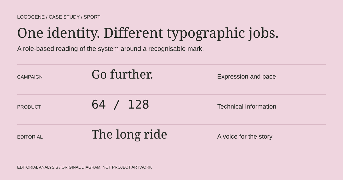
The reported families include Rapha Sans, Rapha Serif, Mono and Semi-Mono. The source links their development to cycling magazines, race materials and technical references, and describes testing the system across applications. These are different kinds of reading, from absorbing a story to identifying a piece of information.
That gives the work a more interesting premise than adding a fashionable headline font. In our reading, the type programme can connect the emotional culture around the sport with the precise information a product must carry. The typesetting matters because scale, spacing and composition decide which voice a reader hears first.
For a smaller business, the question is whether the product detail and campaign headline feel related without becoming interchangeable. Lay them side by side before asking for another font. A shared structure may do more work than a larger library.
Audit the jobs before shopping for fonts
A founder should start with the things the identity has to say. A campaign needs a voice that can attract attention. A size chart needs consistent distinctions and readable numerals. An editorial story needs comfortable reading over several paragraphs. An email receipt needs to work in a constrained technical environment.
If one default style is forced to perform all four jobs, the result can feel flat or inconsistent. Adding fonts randomly will not solve that. Define the roles first, then test whether a smaller set of families, weights and layout rules can cover them.
| Role | Test with real content | Failure to watch for |
|---|---|---|
| Campaign | A short headline and one action | Styling overwhelms the product or message |
| Product information | Sizes, prices, measurements and care notes | Similar characters or cramped spacing create ambiguity |
| Editorial | A long story with captions and subheads | Reading becomes tiring or hierarchy disappears |
| Interface | Filters, buttons, forms and error messages | The brand voice makes ordinary tasks harder |
Preserve what customers already recognise
Before replacing a logo, collect current materials and mark the problems precisely. Is the name hard to read? Is the symbol too detailed? Are the applications simply using unrelated type, crops and spacing? These diagnoses lead to different projects.
If the mark is working, define the elements that should remain stable during the refresh. It might be a silhouette, a colour relationship or a familiar name treatment. Put those commitments in the brief alongside the parts that need more flexibility.
Then make a before-and-after comparison using the same content. A new identity can look stronger simply because its mockups have better photography and shorter headlines. Keeping the inputs constant makes the design decision easier to assess.
Small businesses need roles more than a large font library
A custom type programme is not a realistic starting requirement for most founders. The transferable lesson is coordination. You can begin with one readable family, a deliberate display treatment and a few rules for scale and spacing. Add another family only when it solves a problem the current set cannot handle.
Prepare one product page, one promotion and one long explanation with the proposed system. Give those templates to someone who did not design them. If they can create the next version without inventing new rules, the system is becoming usable.
Document font sources, permitted uses and fallback choices. A typeface that works in a desktop layout may require different permissions or preparation on a website or app. Check the actual font's terms; a familiar family name is not a universal licence.
Review the system at the point of use
Assess information at the size customers will encounter it. A label, an instruction and a checkout error deserve their own checks. Avoid judging only a full-screen specimen where every typeface has room to look impressive.
Ask three people to find a price, identify a product option and explain a call to action. This is a suggested comprehension exercise, not statistical validation. Record where they hesitate and revise the hierarchy before adding more expression.
Rapha's published project shows a type-led approach to renewal. It does not establish a sales effect, and we have no private performance data. The founder's decision is narrower and more useful: identify whether the next investment belongs in the logo, the typography or the everyday templates that connect them.
Describe your business
Explore concepts from your brief, with colours, fonts and a web guide to help you use the logo you choose.
First watermarked preview free. Sign-in required; no card. Download credits: $9.99 for 10, about $1 per generation.