Brand strategy / Food & hospitality · 5 min read
Restaurant branding begins with the service, menu and street
A restaurant identity has to explain an experience before a guest can taste the food. Start with the occasion, service model and menu, then test the design on the street, at the counter and on the smallest takeaway item.
On this page
Describe the occasion before choosing the style
A quick weekday lunch, a destination dinner and a morning coffee habit create different expectations. Start by describing who arrives, why they come, how they order and how long they stay. Those details should shape the identity before a list of style adjectives does.
Then write the menu in plain text. Include real product names, prices, options and the information guests need to order. If the menu is still changing, use realistic examples. A brand presentation made from short placeholder words can hide the difficult parts of the business.
Two food identities, two different sources of form
Charline GROEN's Galopain project draws on medieval references for an ancient-flour bread proposition. Pentagram's Flour and Salt Bakery, by Natasha Jen and team, translates the named ingredients into simple graphic forms that also appear in packaging and interiors.
Pentagram's project account describes black-and-white treatment, custom Chinese characters and environmental applications including tiles and lamps. It is an established portfolio case, not a newly verified restaurant rollout. The useful comparison is how the visual idea relates to the food and the setting, rather than which style another venue should adopt.
Our reading is that both cases offer a strong source for repetition. The system can move beyond a single logo because it has a limited set of related decisions. A small venue needs that repeatability more than it needs an endless collection of decorative assets.
Walk the customer's route
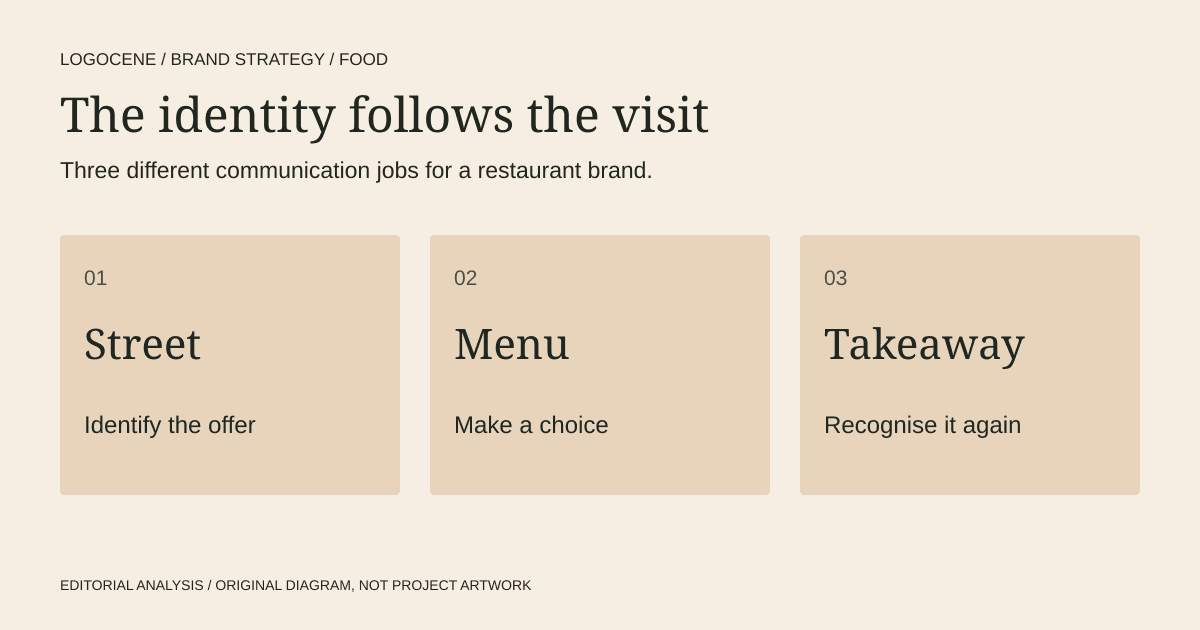
Leave the design presentation and imagine the first visit. Can someone identify the entrance? Does the exterior suggest the expected price and occasion? Can they understand whether to wait, order or sit? Can they find the menu without scanning a crowded wall?
These questions do not all belong in the logo. Some require a descriptor, directional information, menu hierarchy or staff language. Treat the identity as the set of rules connecting those materials, and assign each one a specific job.
| Moment | Main communication job | Practical test |
|---|---|---|
| Street or listing | Identify the business and expected offer | Review the name and descriptor at realistic viewing size |
| Menu | Help a guest choose and order | Use actual prices, modifiers and longer item names |
| Counter | Explain the sequence | Check order, payment and collection instructions |
| Takeaway | Preserve recognition outside the venue | Test the smallest label and a one-ink option |
| Return visit | Keep the experience familiar | Reuse the same names, hierarchy and key visual cues |
Bring production into the first round
Ask the sign maker and packaging supplier for requirements before the final artwork is approved. A material, print process or mounting position may change what is practical. Provide dimensions and request a proof at the intended scale.
Price a simple production version alongside a more expressive one. A limited budget may justify a plain bag and a well-designed sticker before custom-printed packaging. The identity should retain recognition at that simpler level.
Prepare a single-colour mark and a clear name treatment. A detailed crest, delicate script or complex colour arrangement may still have a role, but it should not be the only available configuration. Give staff a reliable default for everyday use.
Make the menu carry information comfortably
Type size, spacing and grouping deserve as much attention as the headline font. Test a long product name and an awkward price. Keep dietary and other important information understandable; determine the actual wording with the people responsible for it.
For digital menus, use WCAG's text-contrast guidance rather than assuming brand colours are exempt. A mark can have an expressive colour treatment while body text uses a calmer, higher-contrast combination.
Print a sample and view it under the venue's real lighting. Ask a person unfamiliar with the menu to order a realistic meal and explain what they think is included. This is a practical comprehension check, not a representative customer study.
Approve a small operating system
Before launch, finish a sign layout, a menu, a packaging item and a short set of rules. Record which fonts, colour combinations and logo variants belong in each. Make one person responsible for maintaining the masters.
Neither project source supplies evidence that a particular identity style improves sales. Their value is more specific: they show how an idea can connect the product, the visual language and the physical setting. Use that relationship to judge your own proposal before committing to permanent materials.
Describe your business
Explore concepts from your brief, with colours, fonts and a web guide to help you use the logo you choose.
First watermarked preview free. Sign-in required; no card. Download credits: $9.99 for 10, about $1 per generation.
Questions
Do I need the logo before designing the menu?
You need a settled name and enough visual direction to work consistently. Drafting the real menu early can reveal hierarchy, language and production needs that should shape the identity.
Should the logo show the food?
It can, but it does not have to. The name, description, imagery and setting can establish the category. Judge whether the complete identity communicates the right experience and remains usable.
Which applications should be designed first?
Choose the three that carry the business at launch. For many venues those are the exterior sign, the menu and a takeaway item, but a delivery-led business may prioritise a listing thumbnail and packaging.