Case study / Health & education · 4 min read
Kids Eat in Color: making expertise feel approachable
A health-education brand needs to communicate competence without making people feel judged. Pentagram's Kids Eat in Color identity offers an instructive example: the name itself becomes a source of play, while the wider system has to support serious information.
On this page
A dual audience creates a real design problem
Pentagram's project account describes an identity for the parenting and nutrition-education resource founded by registered dietitian Jennifer Anderson. DJ Stout's team sought professional authority and a non-judgemental tone. They developed bite-like forms from the name's Os, a food-inspired palette and supporting patterns. The archive dates the project to 2022; this is a retrospective reading, not a new 2026 launch.
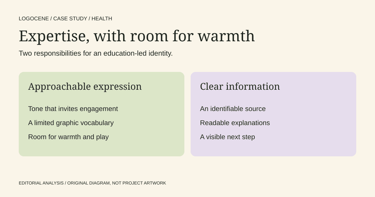
The useful tension is between the adult seeking reliable guidance and the child whose world the brand addresses. In our reading, the identity gives the subject warmth without requiring every communication to look like a toy package. The distinction matters for any business speaking to a buyer and a different end user.
The quiet letters give the playful forms room
Pentagram identifies the supporting typeface as Buenos Aires by Luzi Type, with the main letters in a middle grey and more vivid food-derived colours in the circular forms. Its stated intent was to move beyond familiar rainbows, utensils and crayon lettering. The bite shapes can also act as patterns and motion elements.
Our reading is that the quieter wordmark structure does useful balancing work. If every letter competed for attention, the name could become a collection of effects. Concentrating the play in a recurring shape gives the identity a recognisable device while preserving an ordinary route through the text.
A founder can use that distinction when reviewing a proposal. Point to the element intended to carry character, then identify the elements intended to support reading. If those responsibilities are unclear, adding more illustrations is unlikely to resolve them.
Make a visual idea earn its place
A motif drawn from the name can provide a consistent source for supporting graphics. The practical advantage is a limited vocabulary: a team can repeat, crop or arrange related elements instead of sourcing an unrelated illustration for every post.
That economy is valuable only if the system remains legible. A playful shape in a heading should not obscure the words that carry the advice. A decorative pattern should not compete with a warning, an instruction or a professional credential. Give each layer a job before combining them.
| Layer | Main responsibility | Review question |
|---|---|---|
| Expression | Make the organisation feel approachable | Does the tone suit the audience's emotional state? |
| Information | Explain the subject clearly | Can someone find the action, limitation and next step? |
| Evidence | Support factual claims | Is the source or qualified author identifiable? |
| Navigation | Help people complete a task | Are labels and routes understandable without decoration? |
This model is our editorial framework. It is not a description of Pentagram's internal process or a claim that the identity changed health outcomes.
Warmth cannot substitute for clarity
For a founder in health, education or care, begin by gathering the questions people ask before they trust the service. They may need to know who wrote the advice, whom it applies to, how the appointment works or what a programme excludes. Put those answers into the design brief.
Then prepare a plain-language page containing the real explanation. Add the visual identity around that content. If the page only feels credible after the information is removed and replaced with a slogan, the communication problem remains unresolved.
Review the tone with someone familiar with the audience. Encouraging language can become patronising when it dismisses a difficult experience. A warm illustration does not correct an overconfident promise. This is an editorial review question, rather than a clinical recommendation.
Carry the brand into accessible everyday materials
WCAG's contrast guidance distinguishes logo treatment from ordinary text. The logo exception does not extend to all branded content. A palette that works in an expressive mark still needs approved combinations for body text, buttons and forms.
Create a short list of permitted text-and-background pairs. Include a neutral treatment for dense explanations and a clear method for distinguishing warnings or important notes without relying on colour alone. Verify the finished page; a palette file cannot establish that every combination is readable.
Test an appointment reminder, a printed instruction and a mobile article. Those applications reveal different problems from a large launch poster. Ask the person producing them to follow the rules without consulting the original designer at every step.
What a founder can take from the case
A distinctive system can be friendly and disciplined at the same time. The transferable work is deciding where expression helps someone engage and where restraint helps them understand. Write that distinction into templates, rather than leaving it as an adjective in a brand presentation.
The sources show an identity and explain its design intent. They do not supply controlled audience research, clinical outcomes or conversion results. Use the case as a reference for a design problem, then test your own information with the people who need to use it.
Describe your business
Explore concepts from your brief, with colours, fonts and a web guide to help you use the logo you choose.
First watermarked preview free. Sign-in required; no card. Download credits: $9.99 for 10, about $1 per generation.