Case study / Finance & technology · 4 min read
Achieve: financial branding starts with the next step
Financial branding has to make a difficult next step understandable as well as look credible. Pentagram's work for Achieve connects an action-oriented name, a directional symbol and a reassuring tone; our analysis examines where that promise must be supported by the service itself.
On this page
A service promise needs more than a familiar category colour
Pentagram's account of Achieve credits Michael Gericke and team with naming, positioning, messaging and identity for the digital personal-finance business. The documented system combines an upward A-like symbol, lowercase lettering, electric blue and an encouraging verbal approach. The studio describes the position as a financial partner helping people move forward. We are revisiting that published work, not reporting a new launch or recommending a financial product.
The relevant design problem is emotional as well as functional. A person evaluating a consequential service may need reassurance, but also enough information to understand what happens next. In our reading, a directional identity establishes an expectation of progress. The service then has to explain what progress means in practical terms.
An upward mark creates a promise to explain
Pentagram describes a single-line symbol combining an A with an upward arrow, supported by a gradient and a lowercase name treatment. The continuity of the line is part of the studio's account of finding a path forward. The mark gives the abstract name a visible direction.
In our reading, this creates a useful tension for the communication system. Upward movement is optimistic, but an individual's next step may be modest or uncertain. The copy therefore needs to explain the process in concrete terms rather than let the graphic imply a certain result.
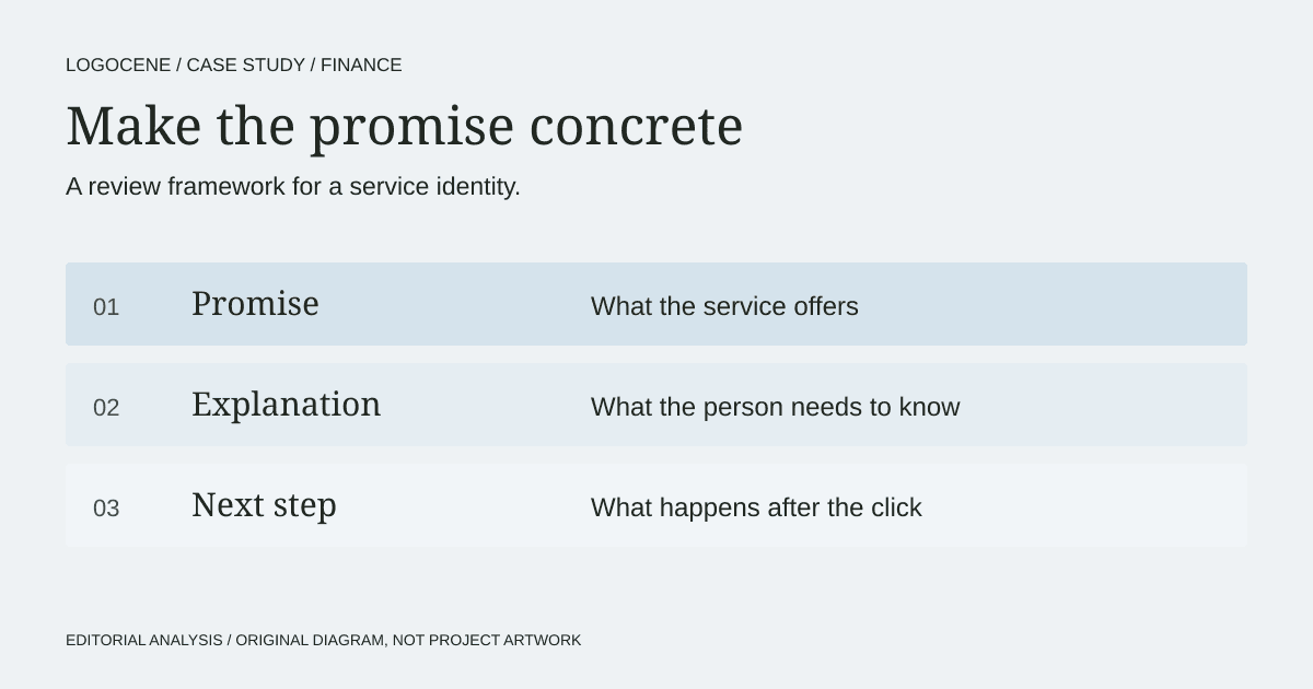
For a new financial or professional service, place the strongest promise beside the explanation of what the first interaction actually involves. If they imply different levels of certainty, revise the relationship. This is a judgement about communication, not evidence about Achieve's results or the suitability of its services.
Connect the name to an action someone can understand
An action-oriented name can suggest a useful direction, but it is deliberately broad. The surrounding language has to make the offer specific: whom the service helps, which problem it addresses and what the next step involves.
For a founder, this suggests a simple exercise. Put the proposed name above three ordinary messages: an introductory paragraph, a form instruction and a confirmation email. Does the same tone remain credible in all three? If the name promises ease but the next screen is confusing, the identity creates a gap rather than closing one.
The exercise works for accountants, insurance brokers, software platforms and other professional services. It does not require an upbeat symbol. It requires agreement between the promise, the explanation and the experience.
Build a hierarchy of reassurance
A clear identity can help someone recognise the service. It cannot establish the suitability of a product, the safety of a transaction or the truth of a claim. Those require their own evidence and review.
| Customer question | What the brand can clarify | What needs separate evidence |
|---|---|---|
| What does this organisation do? | Name, description and category cues | A precise service scope |
| Is it for someone like me? | Audience language and relevant examples | Eligibility and exclusions |
| What happens if I continue? | A visible sequence and clear action label | Actual process, fees and obligations |
| Who stands behind the service? | Consistent identification and contact routes | Verifiable credentials and applicable disclosures |
This is our review model, not a test performed on Achieve's customer flow. The project source documents design intentions and outputs, rather than audited commercial outcomes.
Test the symbol in ordinary service conditions
A mark may appear in a large campaign, a mobile header, an email and a monochrome document. Review each context. Ask whether the shape remains distinct when small and whether the name can still be read when the interface is busy.
Also review how the palette behaves outside the logo. WCAG contrast guidance makes clear that the exception for logotypes does not exempt the rest of a branded interface. Buttons, body text and important notes need appropriate combinations even when a bright brand colour is used elsewhere.
A practical starting set is a display colour, neutral reading surfaces and approved high-contrast text pairings. Add clear treatment for errors and confirmations. This is less visually dramatic than a launch animation, but it determines whether people can use the service consistently.
Review the moment after the click
Bring the identity into a realistic first interaction. State the information requested, the reason for requesting it and the expected next step. Avoid replacing useful detail with a confidence-building slogan.
Ask a few people unfamiliar with the business to describe what they think will happen. Treat their answers as qualitative feedback, not representative market research. If their expectations diverge from the real process, revise the wording before polishing the mockup.
The lesson from this case is alignment: the visible direction and the service explanation should support each other. We have no evidence that a particular symbol, shade of blue or naming pattern produces trust or improves financial outcomes. A founder can still use the case to ask a sharper question about whether the brand's promise is made concrete at the next step.
Describe your business
Explore concepts from your brief, with colours, fonts and a web guide to help you use the logo you choose.
First watermarked preview free. Sign-in required; no card. Download credits: $9.99 for 10, about $1 per generation.